Mantis Coffee House
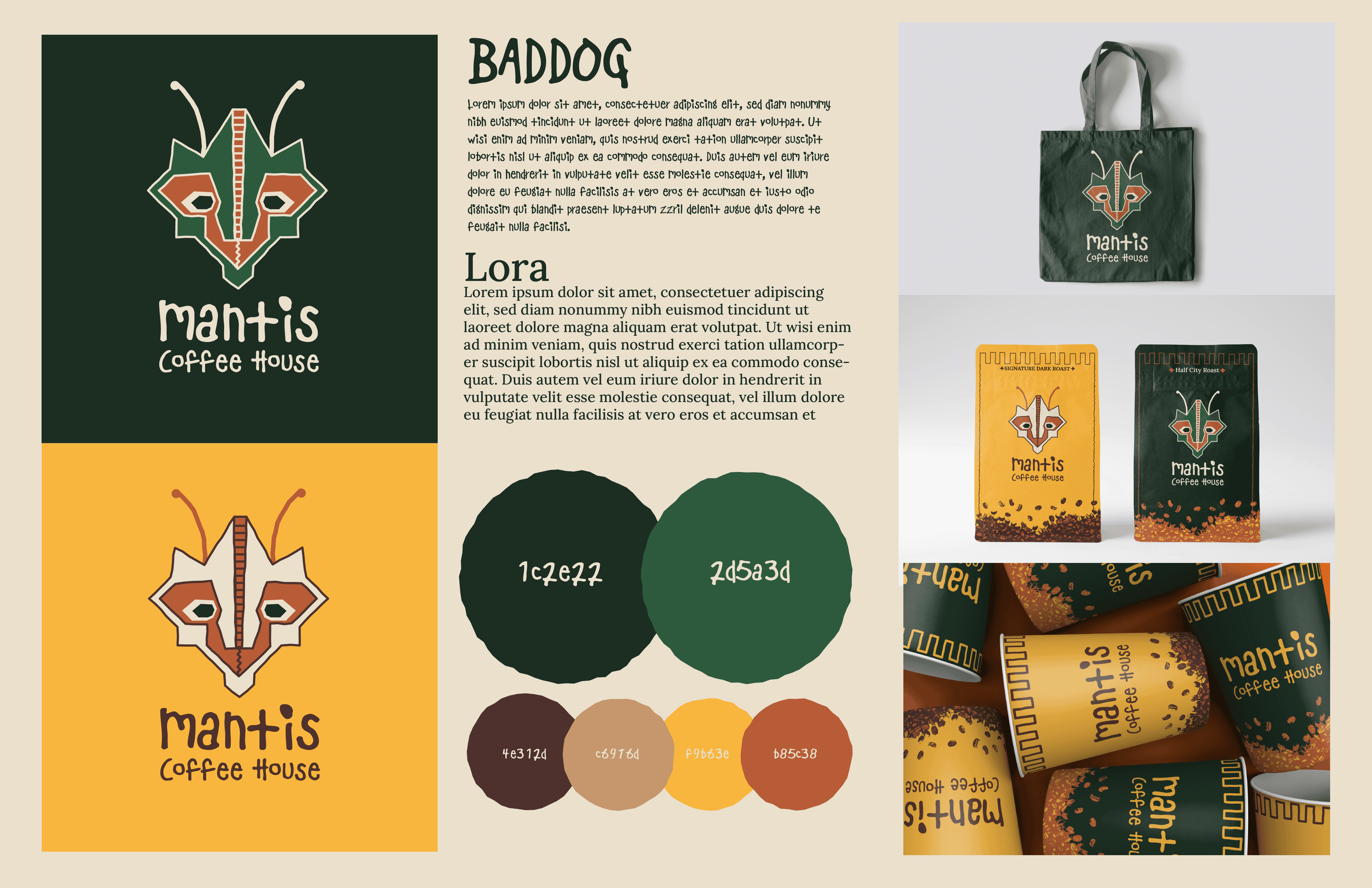
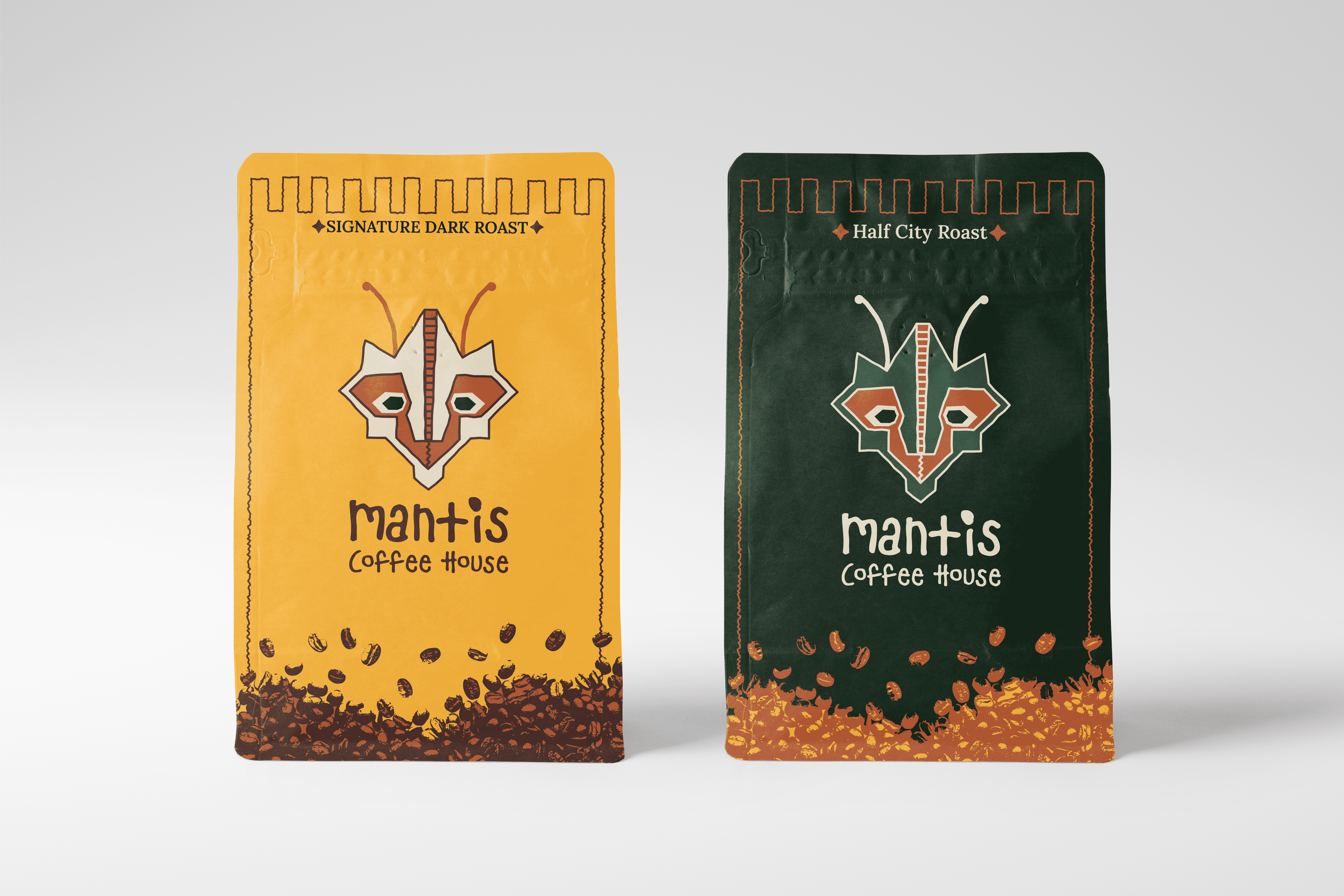
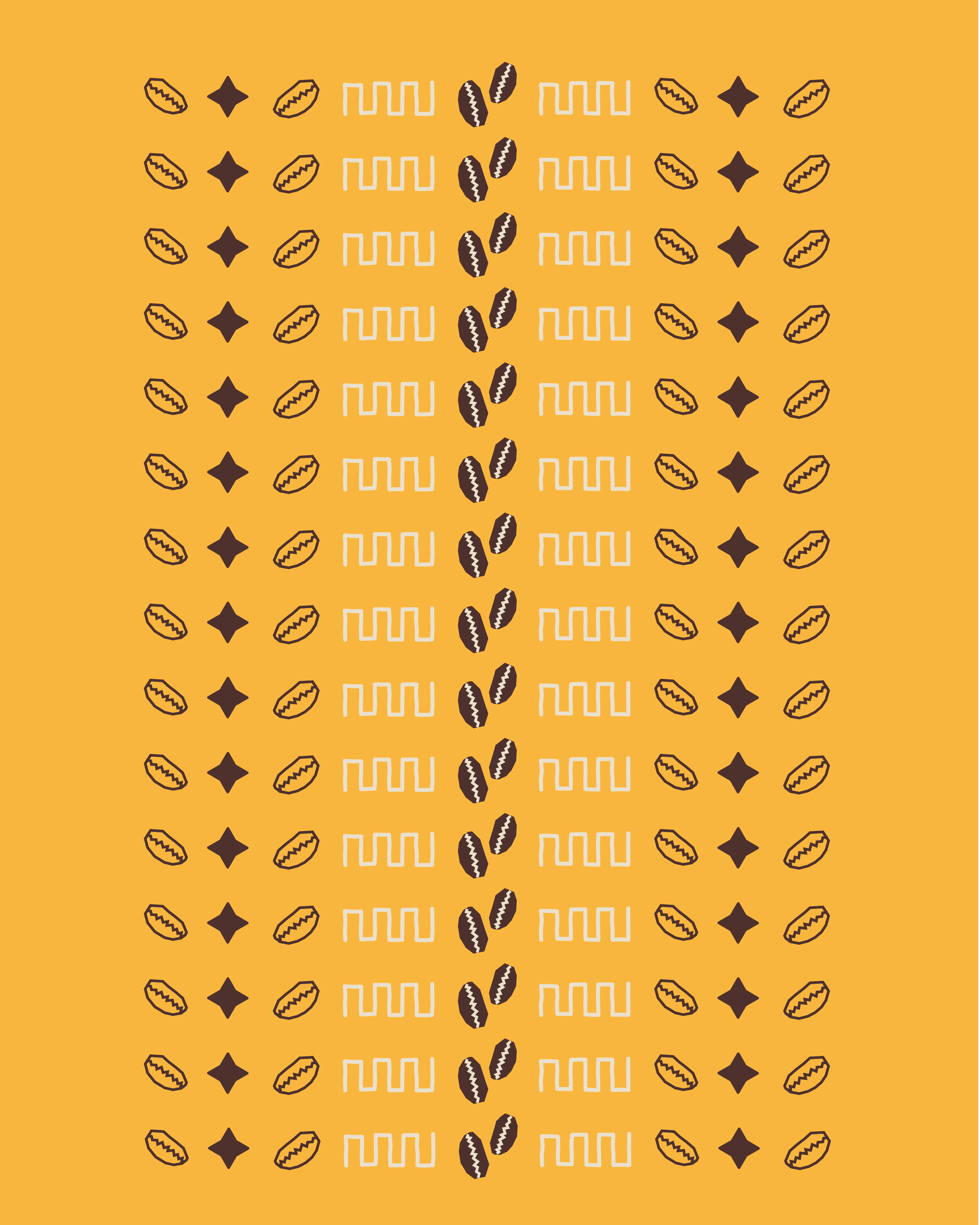
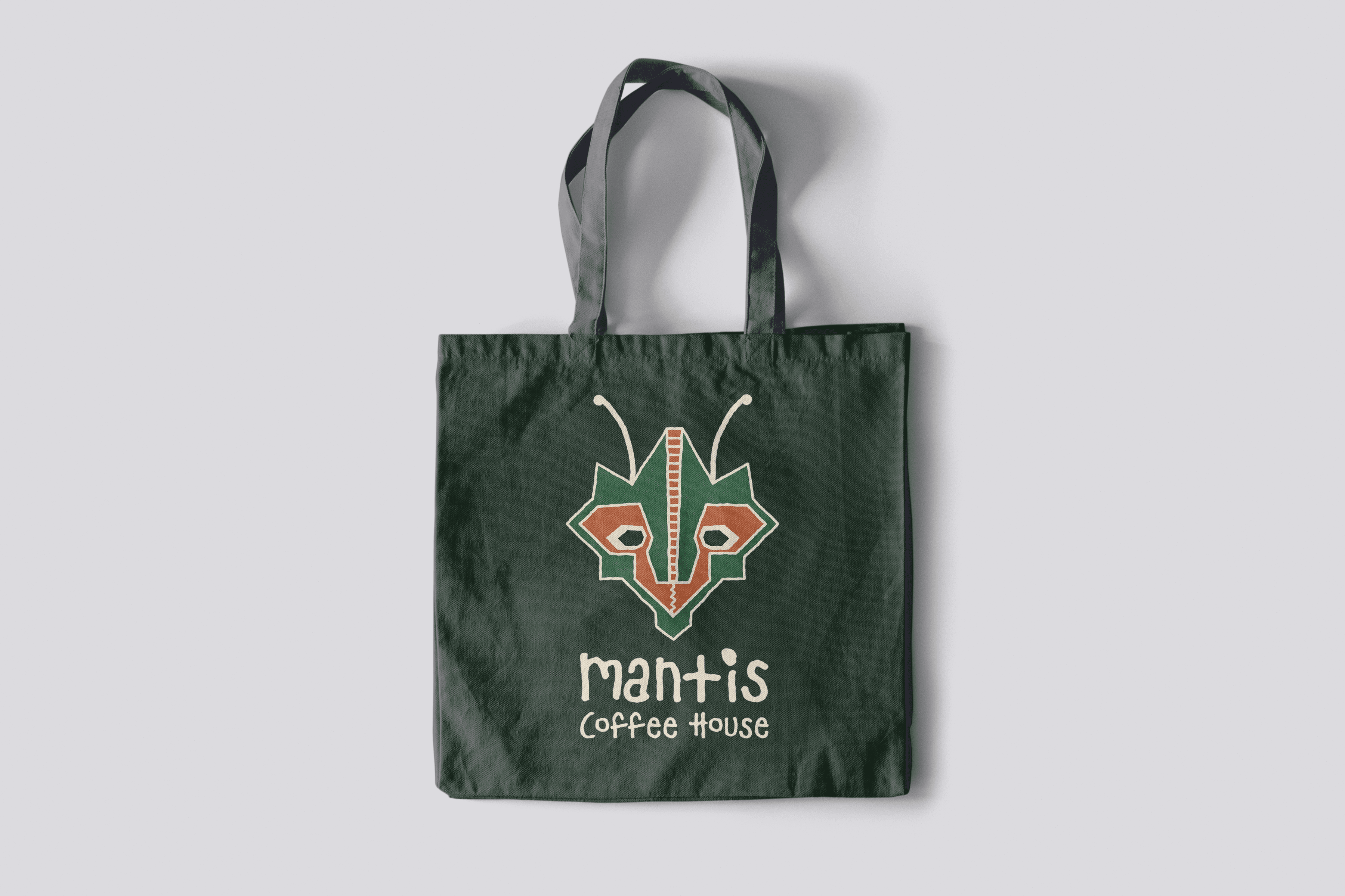
Mantis Coffee House is a brand identity project built around a stylized mantis logomark that gives the brand an immediately recognizable character. The color palette was developed around two primary relationships: deep forest greens to communicate groundedness and a connection to nature, and warm golds and ambers to bring energy and approachability, keeping the brand from feeling too heavy. A hand-drawn logotype adds warmth and personality while a clean serif body font keeps the system readable. The identity was applied across packaging, merchandise, and cups to demonstrate how the core elements work together as a cohesive system at every touchpoint.
Branding
Product Design
Marketing